CSS Button Generator
This free CSS button generator lets you design a button by eye and copy the code for it. Change the colors, padding, corner radius and hover effect, watch the live preview update as you move each control, then copy clean HTML and CSS, or Tailwind classes, in one tap. It runs in your browser, so there is nothing to install and nothing to sign up for.
How to make a CSS button online
Start with the two color pickers: Background color sets the button fill and
Text color sets the label. Then drag Padding X for the space
on the left and right, Padding Y for the space above and below, and
Border radius for how round the corners are. Each slider runs from 0 to 100
pixels. The preview at the top of the screen stays in view while you scroll, so you always see
the button you are shaping. When it looks right, tap Copy to clipboard: the
HTML <button> tag and its .custom-btn rule go on your clipboard together.
CSS button hover effects: scale, lift, glow, outline
The Hover effect menu adds a small animation for when someone points at the button. Scale up grows it by five percent, Lift up moves it up two pixels and adds a soft shadow, Glow wraps it in a halo of its own background color, and Outline draws a ring offset just outside the edge. Choose None for a static button. To try an effect in the preview on a phone, press and hold the button, since a touch screen has no hover. Open More options to set the transition speed to fast, normal or slow.
Rounded, pill and square buttons: border radius
A radius of 0 gives sharp square corners, a value around 8 gives the familiar softly rounded
button, and a high value gives a pill. The pill is what you get once the radius is at least
half the button height, so with the default padding a radius of about 24px or more gives a pill. The value is written as border-radius in pixels in the CSS output.
Tailwind CSS button generator or plain CSS
Under More options, Output format switches between
Vanilla CSS and Tailwind CSS. Vanilla CSS gives you an HTML tag
plus a separate CSS block. Tailwind gives you a single button tag with utility classes such as
px-6 py-3 rounded-lg bg-[#2563eb] text-[#ffffff]. Padding and radius snap to
the closest size on Tailwind's scale, and the preview switches to those same snapped values so
the button on screen matches the classes you copy. Colors use Tailwind's arbitrary value syntax,
so any hex color works without touching your config.
Adding an icon to a button
Tick Add a placeholder icon in More options to put a small
arrow after the label. The output includes the inline SVG and the layout rules that line it up
with the text: display: inline-flex, align-items: center and an
8px gap in CSS, or inline-flex items-center gap-2 in Tailwind. Swap
the SVG for your own icon once the code is in your project.
Frequently Asked Questions
How do I make a CSS button?
Pick a background color and text color, set the horizontal and vertical padding and the border radius, then tap Copy to clipboard. You get one HTML <button> tag with a class and a small CSS rule for that class, ready to paste into your page. Nothing else is included, no reset or boilerplate.
How do I make a pill or rounded button in CSS?
Raise the Border radius slider. In Vanilla CSS the value is written as border-radius in pixels, and a value of about 24px or more on a button with the default padding gives a pill shape. In Tailwind mode the radius snaps to the nearest Tailwind class, and from 40px up it becomes rounded-full.
Can this generate Tailwind CSS button classes?
Yes. Open More options and switch Output format to Tailwind CSS. Padding and radius snap to the nearest step on Tailwind's scale, colors are written as arbitrary values like bg-[#2563eb], and the preview above uses the same snapped values so what you see is what you copy. Tailwind output is a single button tag with no separate CSS block.
What CSS button hover effects can I add?
The Hover effect menu offers Scale up, Lift up, Glow, and Outline, or None. Scale up grows the button slightly, Lift up raises it with a soft shadow, Glow adds a halo in the button color, and Outline draws an offset ring. Under More options you can set the transition speed to fast (150ms), normal (300ms) or slow (500ms).
How do I add an icon to a button in CSS?
Turn on Add a placeholder icon under More options. The generated button gets an inline arrow SVG next to the label, and the CSS switches the button to inline-flex with an 8px gap so the icon and text line up. Replace the SVG with your own icon after you paste it.
Is this CSS button generator free, and does it upload anything?
It is free, with no account or sign-up. The preview and the code are generated in your browser as you move the controls, and nothing is sent to a server.
Recommended
-
 Don't Make Me Think, Revisited (Steve Krug)
Why users click a button, in a short classic for anyone shipping UI
-
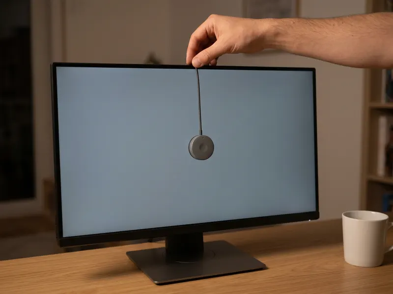 Datacolor Spyder Screen Calibrator
See your button colors true, not just as your monitor shows them
-
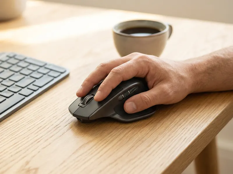 Logitech MX Master 3S Wireless Mouse
Precise, quiet clicks for pixel-tuning padding and radius
Helps keep the tools free. ✨
Images are for illustration only. As an Amazon Associate I earn from qualifying purchases.